The Flowers of Evil #01 — The Montage Show

April 5th, 2013


Wow, is that ugly.

Impressions:

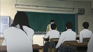
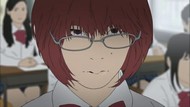
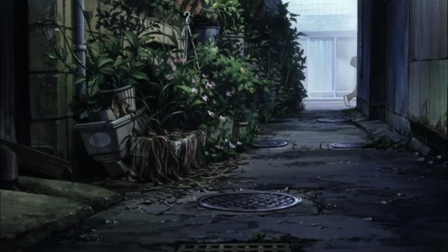
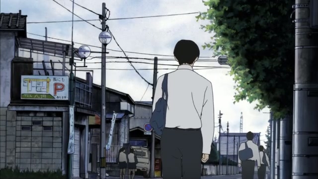
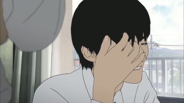
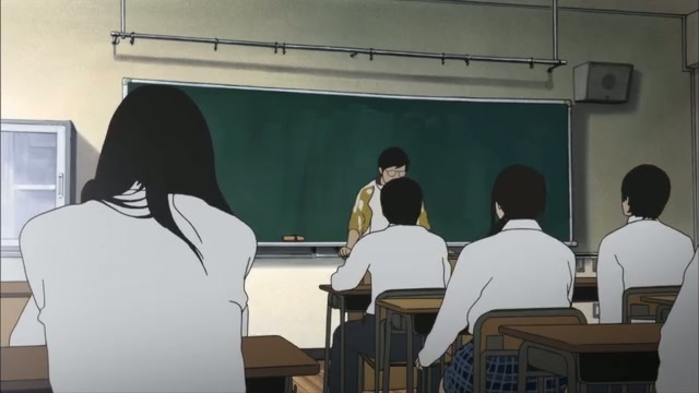
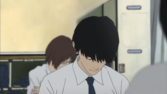
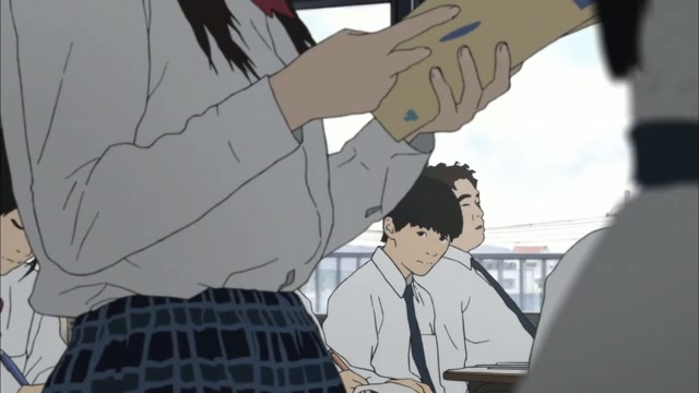
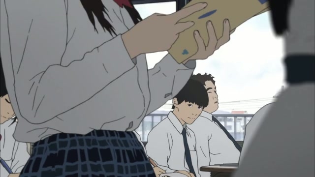
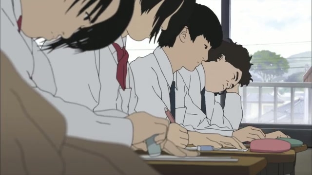
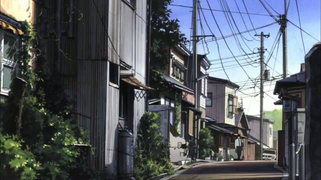
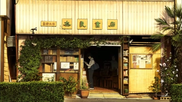
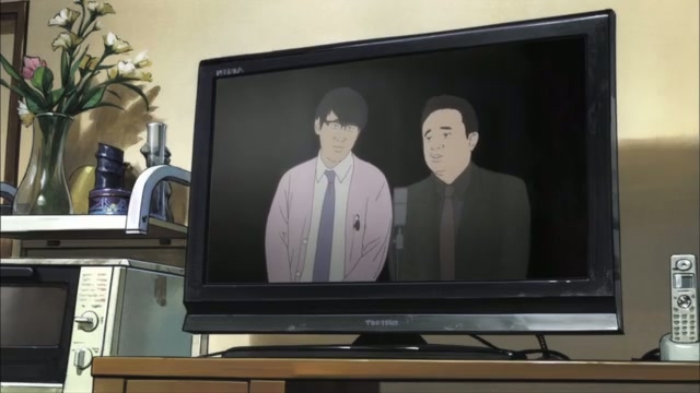
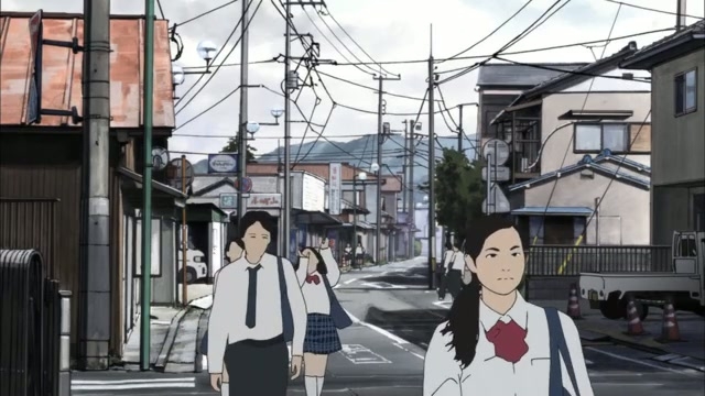
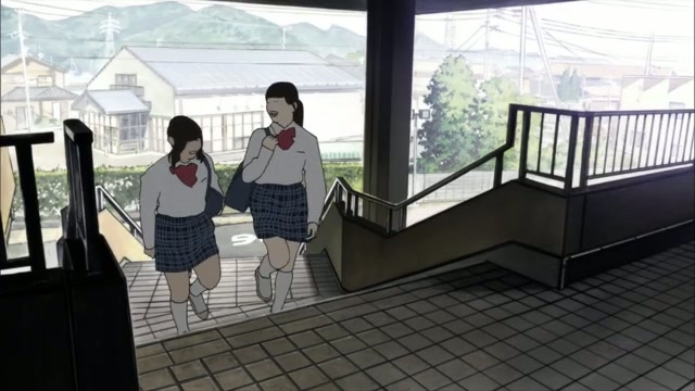
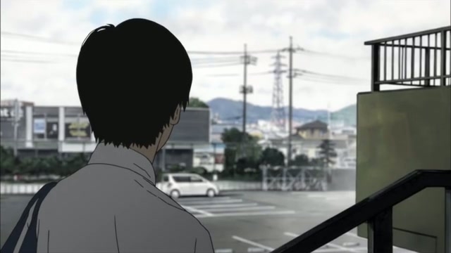
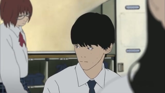
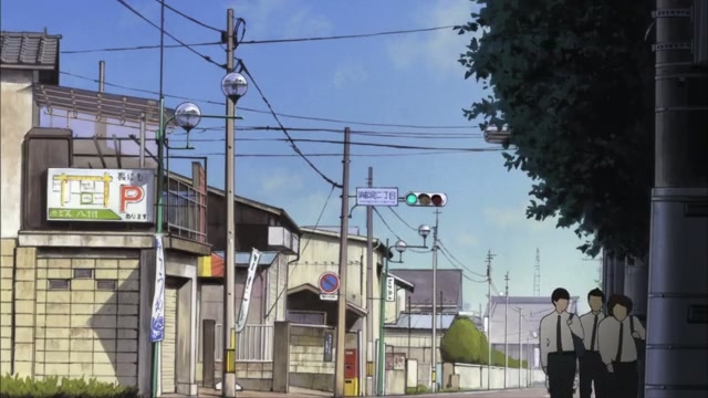
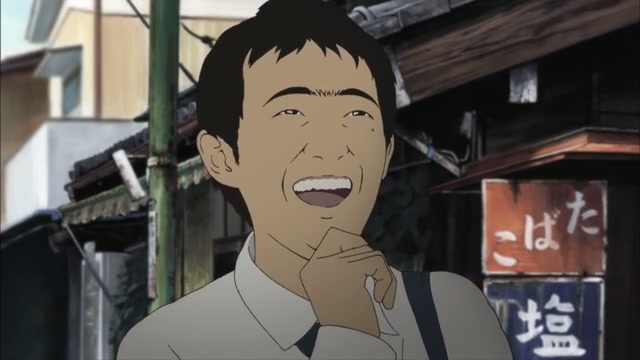
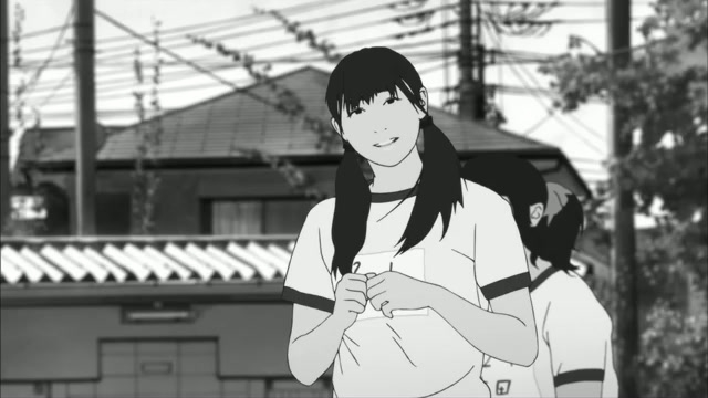
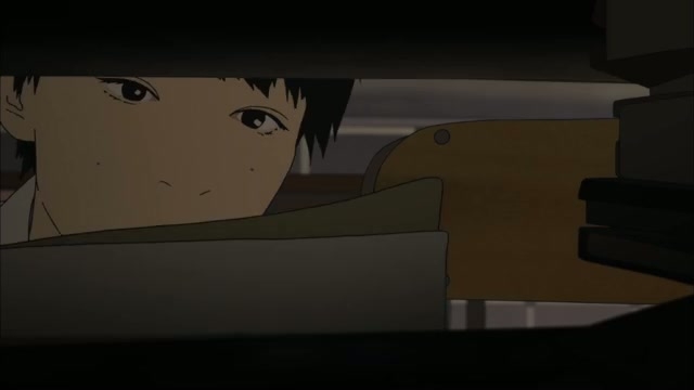
The first thing that’ll strike you here is the art style. 100% of the budget went to the backgrounds, and those just look like they traced over photos. The character art is quite frankly ugly. Flat, undetailed, zero shading, an almost Dr Katz-like tendency for characters to kind of spasm as their line definition varies from frame to frame every time they move, and it really just looks especially awful against the over-detailed backgrounds. You can count the links in a chain fence an entire football field away, while the detail that went into drawing the shirt or hair covering a third of the screen in the foreground was obtained using the bucket tool in MS Paint.

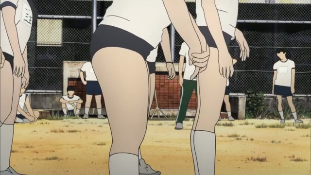
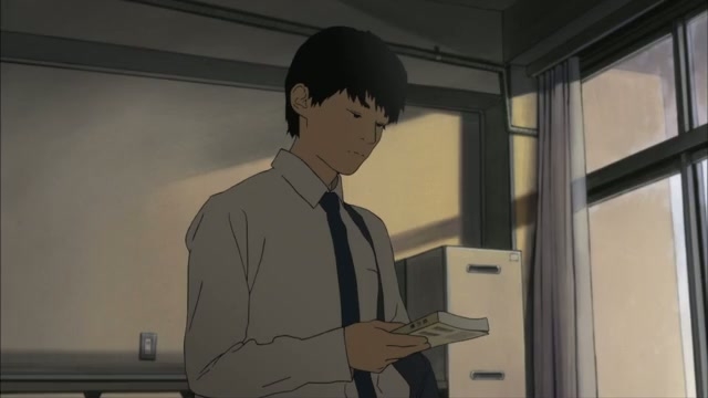
The second thing that will strike you is how much goddamned empty wasted space there is. Hell, the show manages to find a way to begin worse than either an internal monologue or boxy CG trucks; two minutes of nothing. Literally nothing. Just a montage of random pieces of background and people walking past. Worse, this isn’t even the only montage of nothing in the episode. There are two others if memory serves. Recycling the same shots half the time. Even the zero-budget OP recycles shots. They literally could not even come up with enough content to fill one episode and needed to stretch it out with about four to five minutes of pictures of streets. Good god, they didn’t even reach the blurb on the website about what the show is about.

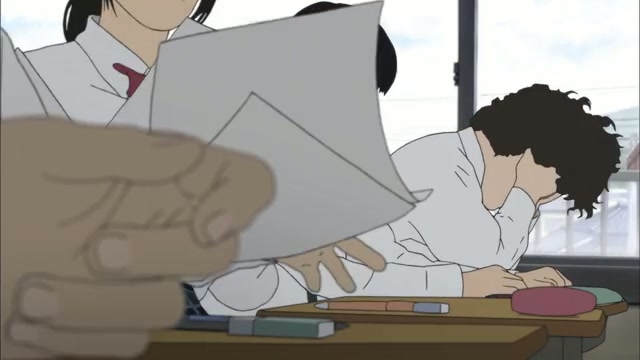
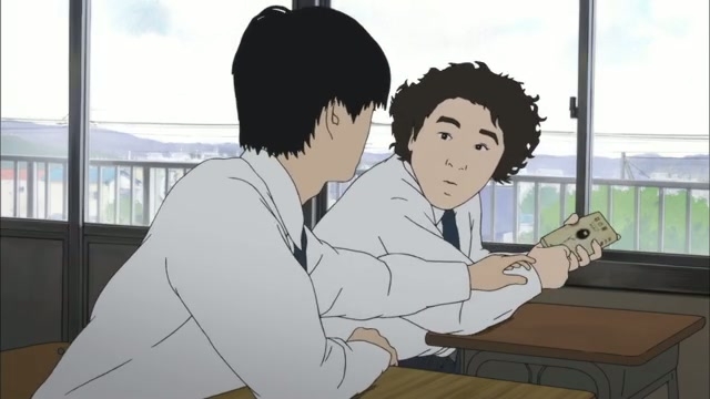
Also note that that’s when something sort of threatens to happen (but doesn’t yet), kicked off by internal monologuing, which is also the first time that the protagonist shows any thought whatsoever. I’m tempted to call it pretentious just for the ending minute/credits, but 95% of the episode isn’t even that. It’s just empty wasted space on photo-sketched backgrounds.


Posted in Anime | 18 Comments »

18 Shouts From the Peanut Gallery

  • algorithm says:

    Fingers were crossed cause I knew some kind of shit was bound to happen when no characters appeared in the trailer. I just didn’t expect it would be this severe.
    I’ll just stop shitting on Kyoani for a while.

  • Echelen says:

    Clearly rotoscoping is the future.

  • kenuran says:

    Damn they just annihilated the source material. None of ZEXCS other shows has ever looked this bad but they managed to outdo themselves this time. Should’ve just make it live-action if they are gonna rotoscope everything.

    Oh well, life goes on.

  • slicendice says:

    Oh God WHY, WHY?!!! One of my favorite manga, reduced to this…

  • Gorilla13 says:

    Oh no… I hope the guys who overhyped this shit didn’t hang themself out of bitter disappointment lol

  • Ohnoo says:

    While I understand that the point is to break away from the “usual, conventional anime-ish designs” what I’m seeing here makes it look cheap.

    I wasn’t planning to follow the anime and stick with the manga, but if what they’re doing is to make people run away to the manga, I think they’re doing real good – or possibly the contrary as well.

  • sage says:

    It’s amazing how your review doesn’t do justice to how incredifuckingly bad this actually was. You are losing your edge.

    • Anon says:

      No review can do this thing justice. I read many reviews and saw many screenshots and knew how horrible it was before actually watching it. But it goes waaaaaaaay farther! The animation itself is so horrible and non fluent that i thought my computer had a problem. The voice acting is horrible and doesn’t even sinc in with the lip movements. The soundtrack is close to non-exsistent. The opening is horrible and out of place and the ending is “we are so edgy and deep” and again out of place. Don’t stick “BE DISTURBED” in my face, make me be disturbed by the content of the show, and I don’t mean by how horrible it is! As a fan of the manga I say no review can do it justice. You need to read the manga and than watch it in its full glory.

  • Anonymous says:

    This is one of the worst things I have ever seen. Although from looking at the source material it isn’t much of a waste.

  • rufe says:

    It’s very different from the source material art, that’s for sure!

    I actually kind of like what they’ve done. Somehow the backgrounds and character animation and design gives me an older vibe. The acting and opening also seem like an older approach. Of course the dialogue is quite modern. To me the depiction of youth is pleasantly convincing.

    I think I’ll give it a few weeks to see what they do since I think this style could be interesting if they use the art to some purpose. I do hope they collaborated with the manga artist and didn’t impose this on their work….

  • Anon de Paris says:

    I love how all pretentious artsyfags are flocking to this turd all like, “You Plebs can’t simply apppreciate true art” while flaunting their monocle and top hat.

  • jingoi says:

    I’ll count looking at this review as previewing it. Dropped.

  • Catz says:

    BLEERRGGGHHHH!

  • The Phantom says:

    This looks so ugly is almost unwatchable, in fact the plot is irrelevant because you will be stunned the moment you watch this cheap visuals, unable to go on.

    If they were going to do something this cheap, they should have resorted to flash animation.

  • Anon de Paris says:

    Here we go, the circlejerk have started.The pretentious hipsters tries to fend off all of “It’s lazy, half-assed and shoddy.” complaints with “It’s meant to portray the bleakness of reality. You moé kids who lived sheltered lives in lolicadia just cannot comprehend art *put monocle on*”